During my tenure at Futura Publishing I was involved in the creation of a startup publication that the publishers believed would fill a void in the consumer magazine market. It was geared toward the upwardly mobile Latin community with a positive spin on the their heritage.
My duties were to design an overall look for the book and incorporate other designers’ pages or section creations into the uniform style, thus, ending up with something that worked as a whole. It was also decided to have a “fun” feel to it to make it something people would look forward to reading. That would help to build a regular customer base.
The decision for the size of the magazine was to be tabloid for several reasons. At the time, Interview Magazine, Paper Magazine and W Magazine were tabloid sized and used newsprint paper because it was cheaper to produce. We modeled ourselves after those publications. They stood out on the newsstands and they were instantly recognizable.
Like them, content wise, we aimed to be hip, smart and different. We featured large photographs accompanied with illustration and in-depth articles.
An idea for the sales aid media kit was to combine highlights of the first issue with advertising specs and rates. It was decided to form this in the model of the actual magazine itself. This made it easier for the sales force to secure advertisers and subscribers precluding the introductory issue. Samples of both are shown below.
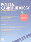
Later, I also redesigned and updated the look for the trade magazine, Practical Gastroenterology.
Home • Résumé • Illustration • Contact
Brochures | Carriers | Creative | Detail Aids | Direct Mail | Exhibit Graphics | Journal Ads | Logos | Packaging | Sell Sheets
Animation | PowerPoint | Web Marketing | Web Sites
©2025. Arthur George


